

Today, most diners research restaurants online before visiting in person. They usually search when they’re on-the-go, looking for an easy-to-read page that can quickly tell them the essentials, while also giving them a feel for what your place is all about. While a professionally-designed website might sound desirable, a user-friendly, functional one is more important. Luckily, there are a bunch of cost-effective tools out there to help you design your own site.
SquareSpace, WordPress and Wix are some services we recommend, and even have themes specifically tailored to bars and restaurants to help you get started.
For even more features—like online menus, ordering and reservations—there are some great new premium services made specifically for restaurants and bars: BentoBox, Flavor Plate and Let’s Eat are just a few.
Regardless of the level of design you’re going for, here are nine essential website design features for your bar or restaurant.
These days, most customers want to see the menu before they go to a bar or restaurant. This means it’s essential to include all your menus online, including brunch, lunch, dinner, bar snacks, cocktails, wine list, draft list and any speciality menus, such as gluten-free and seasonal options.
Make sure your menu page is standard HTML. No one wants to take the time to download multiple PDF files. Also, HTML is easier for employees to edit, which is important for menu updates.
Keep in mind, most people searching for a place to grab a beer and a bite are using their mobile devices. This means, your menus should be optimized for mobile.
A hungry consumer isn’t going to take the time to search high and low for your contact information. If they can’t immediately find your address, phone number and hours, they’ll likely find a competitor’s site where this information is plainly visible.
It’s critical you display all of this information near the top of your website so customers don’t have to look hard to find it. Make sure your address is in a text that’s copyable, so people looking at your website can easily copy and paste the address to friends. And remember, most of your visitors will be on their phones, so ensure your bar’s phone number is a one-press button for calling.
If you want to make your restaurant even easier to find, add your business to Google Places. This way, if someone is in your local area and they search for bars or restaurants, your business will show up in the results, making it easier for people to find your establishment. You can also add a GoogleMaps widget to your page that shows exactly where your restaurant is on a map.
When you set up your ‘About Us’ page or fine tune your current one, we suggest you introduce customers to your business by telling them a short story. One of our customers, Papagayo, does a great job of this.
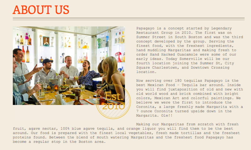
Not only is this a great introduction explaining how they started, what they pride themselves in, and what they’re known for, but this rich content also helps Google find their page. When Google is able to find a business’ page, the site will be rewarded by attaining a higher position on the search page.
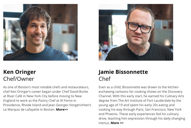
If you run a smaller or single location establishment, you can add some credibility and personality to your ‘About Us’ page by including pictures and short bios of your staff members. Toro, another one of our valued customers, has pictures of the owner/chef and chef, and short bios that can be expanded to show more info. These text rich pages are also beneficial for SEO purposes.
The ‘About Us’ section is also a great page to put any awards your establishment has won. Area Four displays their Boston awards along the bottom of their About Us section.

Customers like to connect with restaurants and bars via social media. They like to share pictures of decadent margaritas and delectable sliders. They want to know when you’re hosting trivia and what your newest cocktail looks like. Your website should have social follow buttons for your Instagram, Facebook, Twitter, and any other social accounts you have. This way, your site visitors can get to your social profiles with a click of a button. Shepard in Cambridge includes social sharing buttons across the top of their website.

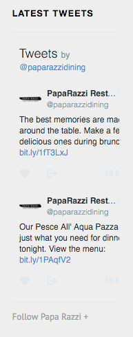
This placement makes them easy to find. If you want to go a step further, you can include live feeds that preview what’s happening on your social media pages. Paparazzi, the Boston trattoria bar, includes a feed with their latest tweets at the bottom of their homepage, easily communicating small bits of information about their establishment and giving customers a preview of what content they’ll receive if they became a follower.
Also, consider adding an Instagram feed. Featuring a live photo-based feed will give you the opportunity to continuously showcase your restaurant’s food and beverage options as well as the customers who frequent your space.
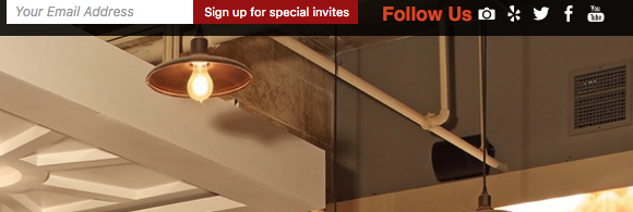
When customers search for a place to drink or eat, they usually head straight to review sites like Yelp, Google+, and TripAdvisor. In fact, 97% of consumers say they read reviews about local businesses. To encourage customers who visit your website to leave a review, be sure to include an easily recognizable button that brings your customers right to a review site. For example, Tavern Road includes a Yelp button at the very top of their homepage next to their social network icons. With just one click, customers are taken to Tavern Road’s Yelp page where they can easily make and read reviews.
Another way to incorporate customer reviews on your website is to include review site widgets. We suggest you find a way to incorporate positive reviews on your website because 90% of consumers say positive reviews influence their purchase decisions. To create a scrolling showcase for their most excellent review, Trade Boston uses the TripAdvisor “Rave Reviews” widget.

If you’re curious which TripAdvisor widgets are available for your restaurant’s website, you can search for them here.
If you don’t want to bother with widgets, you can also manually pick and publish positive reviews to your website. Customers want to know what their peers think of your service, your atmosphere, and your food. Let your customers describe your restaurant for you by continuously updating your website with unbiased testimonials.
When people visit your website, it should be incredibly easy to book a reservation. In a world of instant gratification, people are looking to quickly and painlessly plan a night out. If you only offer phone reservations, you might be losing customers who don’t feel like picking up the phone. If your restaurant offers reservations, you should provide an online booking option. By including this, you’ll decrease the number of phone calls during your busy hours, helping to better manage your staff’s time and allowing customers to make reservations when you’re too busy to pick up a phone or you’re closed.
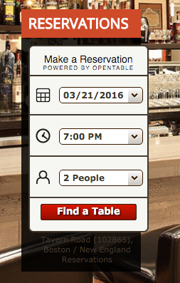
You can also implement reservation widgets, such as Yelp SeatMe, OpenTable or Reserve, directly onto your website so customers can easily book a table without having to call anyone. Tavern Road includes an OpenTable widget on the sidebar of their homepage making it extremely easy for patrons to make a reservation.
Five Horses Tavern in Somerville also uses an OpenTable widget, but in a different format.

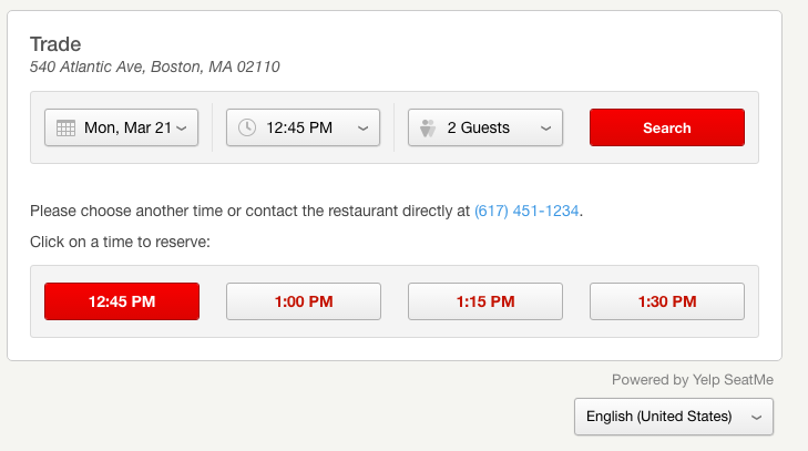
If you want to keep your website more clean-cut, add an attention-grabbing button that takes users to a separate page for booking like Trade Boston does. However, keep in mind that this adds one more step than the previous two options.

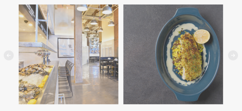
Before customers come in to dine, they want to know what the atmosphere of your bar or restaurant is like. They want to know if your establishment is fancy or casual, what the interior looks like, what the view looks like, etc. To meet this demand, you should include a good variety of high quality images on your website. Show them the inside decor, your outdoor seating (if you have any), the view from your best table, and your most aesthetically pleasing plate. Remember, consumers spend 2.5x more time on a business page with photos than one without. Plus, photos are an effective way to give people an idea of what to expect! As you can see below, Row 34 has a photo gallery that includes photos of their establishment as well as photos of beautiful dishes.
Did you know, 97% of Google searches for the keyword “bars” come from mobile devices? People don’t plan too much ahead of time when it comes to where to drink. They’re constantly on the go and they’re in need of a quick access to an address, directions, a phone number, and hours.
Optimize your website for mobile users or risk losing customers. If someone visits your website on their smartphone, and he can’t easily click to call, locate you via Google Maps, or read your menus, you’ll likely lose him to a competitor with a more informative site. Google also favors mobile responsiveness. So, if you’re trying to improve your organic traffic, or you’d like to at least keep it at a steady level, you need to optimize your website for mobile.
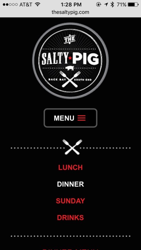
Above is an example of The Salty Pig’s mobile optimized website. They have easy to use drop down navigation, and their menus are individually listed in plain text.
Another way to boost your organic traffic is to establish some basic SEO (search engine optimizations) strategies. SEO helps search engines find your site and also rank your page’s relevance so it appears near the top of the search engine results. We realize you’re probably running a busy establishment, so you might not have a ton of time to spend on advanced SEO practices. However, by implementing a few basic practices, you can get more customers into your bar or restaurant.
First of all, make sure you have short, descriptive title tags for every page of your website. It’s a best practice to make sure they’re between 20 and 60 characters long. Include meta descriptions that describe each page in no more than 150 characters. Do not try to game the system by flooding your pages with the keywords because you want Google to rank you well. Google is onto these tricks, and your site will receive a penalty in the page rankings, which can take many months to recover from. Remember, customer experience should always come first! In addition, you can also register on restaurant directories like Urbanspoon, Yelp, Foursquare, and Yellow Pages. Or as Jeremie mentioned in the comments, you can get in touch with bar guides in your area such as WorldsBestBars.com or Liquor.com.
You might be thinking these 9 steps to website optimization seem like a lot. Keep in mind, having these elements is essential for bringing more people into your establishment, especially in today’s highly competitive industry.
The hard truth is that 89% of diners research restaurants online, and 85% of people will leave a website if it’s poorly designed. Whether you’re building the website on your own, recruiting your tech-savvy friend, or hiring a third-party service, these website features are essential in order to be a valuable resource to potential customers. If you’re looking for a third-party service, we recommend BentoBox, a company that many of our customers use!
If you’re looking to revamp your website to bring in more foot traffic, you should also consider digitizing your bar inventory and ordering to boost your business. With BevSpot technology, you can access all of your bar’s data in real-time and grow your business faster—from anywhere.
Schedule 15mins to chat with a product specialist
Start a FREE Trial Today! BevSpot offers full product education and account setup for all customers! No card Information needed!
