
While some may see it as an afterthought, a well-designed menu is an opportunity for a powerful first impression and a cohesive customer experience.
If you suspect your menu’s appearance may need a refresh, or if you’re starting with a blank canvas, here are four tips for menu presentation from a graphic designer, with considerations from two restaurants with beautiful menus.
While printing may seem like the last thing to discuss, considering production at the start will allow you to efficiently plan budget and design.
Going to a local print shop will yield more professional-looking prints, but for many restaurants, frequent modifications make in-house printing the best option. However, even a professional design will suffer when it’s printed or cut poorly, so it’s important to research a quality printer along with the the paper that it can handle.
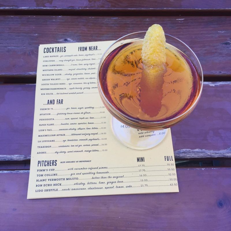
With changes coming to their menus every two weeks, Bar Manager Heather Mojer and her team at State Park, a local favorite and early BevSpot customer in Cambridge, MA, have figured out a great system to edit and print their menus in-house.
“We print our menus with our trusty laser jet printer. [It’s] water-resistant unlike inkjet which can bleed.”
While her printer limits paper size, that didn’t stop the Heather’s team from getting creative. State Park rotates their menu editions between four different paper colors, which not only enhances presentation, but also helps the team keep up with version changes.
Your printer will restrict heaviness of paper as well, so consider mounting it to a clipboard, placing it inside a sleeve or book, or folding it like State Park.

Take a look at your menu. Is the text large enough and dark enough to read? Are the category titles easy to scan? Are the offerings clear?
The most valuable thing a well-designed menu can do is help patrons quickly understand the offerings at your establishment. A menu is simplest to take in when there’s proper organization, clear text, and breathing room for the eyes to focus.
State Park started out with a single menu when local agency ICS Creative designed it. But when their selection grew, they accommodated by splitting out the menus. This provides a good lesson: the items on your menu should dictate the format.
Organize your food and drinks not only on separate pages but also under distinct headlines. No matter how you decide to split and display your items, consistency is key.
For emphasis on headlines, try increased type size, bold text, or all-caps—but use these methods sparingly. Descriptive text is always helpful, but should be less prominent.
Whether you’re designing it yourself or working with a template, patrons should remember you for your food, drinks, and service, not for your wild menu colors and fonts. Simple, dark text on light paper will always be easiest to read.
Having an on-brand menu means it successfully fits in with the concept of your establishment, but also seamlessly goes hand-in-hand with all other printed and digital materials.
If you’re a new establishment without any existing visuals and you have the budget for it, hiring a design professional who is experienced in brand design is certainly the best choice.
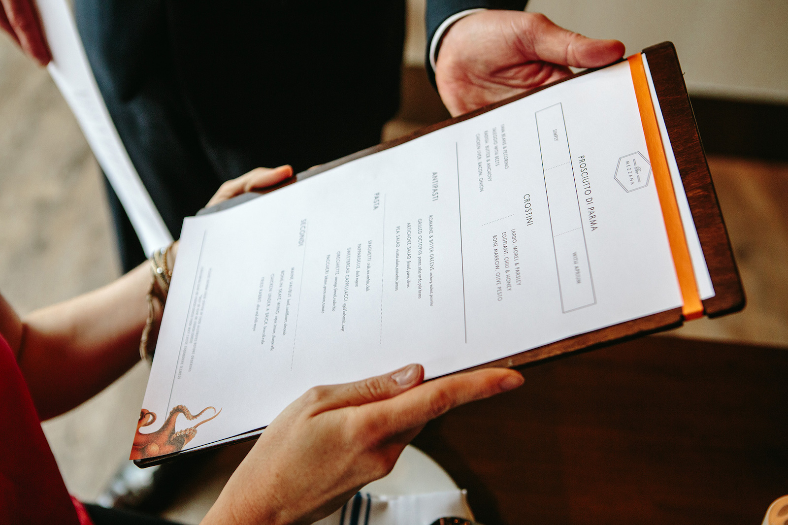
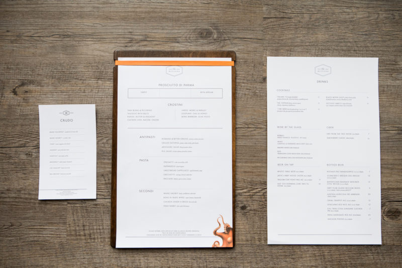
Before coastal Italian restaurant Bar Mezzana opened in Boston’s South End in 2016, graphic designer Kim Miller created the restaurant’s entire visual brand identity.
“I designed all of the brand materials, which included the logo, website, business cards, letterhead, coasters, menus—everything down to the matchbooks. But, before all of that happened, I delivered a style guide which became the foundation for all design work to come.”
Kim’s holistic approach allowed for a beautiful, cohesive experience between all of Bar Mezzana’s materials—not just the menus. Kim delivered templates to the team at Bar Mezzana and made sure that they were able to properly edit and print their food and drink menus on their own. No matter what dishes change on the menu, the organization, readability, and brand continuity that Kim put in place shines through.

Are your customers deciding on their dinner and drinks in a dimly lit room? Do your menus become stained when they’re spilled on?
If lighting is low, emphasize a high contrast design, like black text on white or beige paper (see above Organization and Readability section). Menus on your computer screen will look different once printed out, and often will appear less bright. Whether you’re designing the menu yourself or having it done professionally, it’s important to print it and read it in your dining areas to make sure it’s legible at different times of the day.
And while they may look perfect coming out of the printer, remember that your menus sit on bars and tables. Soon they’ll get splashed with ketchup and red wine, or perhaps fall on the ground and get stepped on.
Heather’s staff makes sure to cycle out any menus that inevitably suffer from environmental factors.
“Our menus get lumpy from light use which is not a problem for us but it’s when they inevitably get stained, bent, or torn that we nix them. Our staff sifts through the menus for those problems.”
If your menus aren’t protected by a cover that can be wiped clean, be prepared to remove damaged copies from the rotation.
When you hold your menu in your hands, is it something you’re proud of? Is it printed well? Does it reflect your restaurant’s brand? Is it legible in its environment?
For patrons, restaurants are about the experience. While menu items are meticulously created, menu presentation is often overlooked. As a designer, I am impressed and excited when menus are carefully considered. I’m sure I’m not the only one.
How is your current menu design and production process working? Would you be interested in menu design tools from BevSpot? Take our quick survey to be a voice in the discovery process of this new tool.
Schedule 15mins to chat with a product specialist
Start a FREE Trial Today! BevSpot offers full product education and account setup for all customers! No card Information needed!
